Tuesday 24 October 2017

Papercraft Toolbox Prototype


For this papercraft prototype, I chose the toolbox design from the previous post. It was based on a wooden toolbox I put together in grade 6, and later in this post I will provide a side-by-side of the prototype and the original object for comparison.


Using Rhino, I turned the toolbox design and plan into printable sheets (as shown across the top in the image). There were not originally this many sheets as I tried to start small.


Starting small was not a good idea for this design. The object could have worked well at this size with the rectangular base and taller faces on the sides, however, the dimensions made it very difficult to construct the post. It was incredibly hard to glue the tabs to the post on the big object I ended up making, and nearly impossible for a first-time papercrafter like me to be able to do such a thing with this tiny piece.

As well, I initially had problems folding the cardstock. By using the paperclip to score I ended up not getting the lines I wanted and, because I was using coloured paperclips, some of the colour would rub off onto the paper.

Unhappy with the lack of progress, I switched to larger dimensions and found an easier way to score the paper. I found I like using the backside of the hobby knife much better as its duller than the blade but the point still drives a decent enough dent into the paper that makes folding easier.


The second time around, I made the plans large enough that the biggest pieces fit the majority of the cardstock.


After cutting out the cardstock pieces, I began assembling the toolbox starting with the rectangular base.


To attach the handle to the base, tiny tabs were glued to the interior walls.


This is the finished prototype (right) beside the original toolbox (left).

The papercraft toolbox did not end up as detailed as i had planned. This was due to my early struggles folding and gluing as well as the challenge of putting together the handle. The exterior walls of the base not connected to the six sided polygon are more rounded and floppy than I would like and some sort of support to make them more rigid will likely be needed going forward. As well, a sturdier solution to the handle tabs might be in order. Even though the small tabs worked this go round they were very difficult to put in place and could prove unreliable.


Tuesday 17 October 2017

Objects Unfolded


For this project I have ten objects that I've encountered in my lifetime that I have designed in Rhino that have been unfolded into flat templates for easy printing. 

Pool Cue:


First off is the pool cue. I honestly cannot remember a time without the pool table, I'm sure it was purchased long before I was born. I am absolutely terrible at the game and only play with close friends. I didn't choose the pool cue because I'm a pool champion though. I have strong memories of the pool table at my old house; my brother and his best friend used to play all the time. That was so long ago I probably wasn't tall enough to play myself but I loved watching and the table was in a tight enough space that you had to dodge pool cues when the guys took their shots so the object definitely came to mind when I started this project.

Marker and Cap:


Honestly, the marker is probably what got me into art. When I was younger I was glued to colouring books and I always hated crayons with a passion. Even now I like incorporating marker into my art every once and a while so I'd say it's been with me while I've grown as an artist.

Tool Box:


This is the only thing I've ever really built. I'm not sure how my middle school teachers managed to get me to do this. But honestly it's something I was really proud of when I built and had to try building in Rhino. 

Lamp:


I've had the same lamp for at least a decade. From when I used to stay up late reading to now when I fall asleep doing homework and I accidentally leave it on. As well as the time when I was younger and I almost started a fire because I could turn the light green by putting a plastic green cup over the lightbulb! The object fits right in to this collection.

Marbles Board:


I never met my great grandpa but he built like a dozen decent board games (all the same game) for members of his family. My family has at least one, my grandparents have a couple and so on. It's like the game Sorry but the board forms a hexagon shape and there are small indents in the board (not shown in the 3D model) for marbles to sit and be moved around as pawns. This game gets overplayed around Christmas.

Bean Bag Toss:


I have family friends that are super competitive and for some reason they these giant planks with a hole cut through them (circular in real life but square in the 3D model). They're used for ridiculously intense games of bean bag toss where its like 1 point if you toss one and it lands on the surface of the plank and 3 if you get one through the hole. 

Pumpkin: 


Halloween is like the best holiday in my opinion. For one, there's free candy (until you get older and it sadly becomes less socially acceptable to beg strangers for sugar). But I've always been a fan of the typical horror stuff around Halloween and Halloween traditions. The pumpkin is like a Halloween icon and since it's October I had to try to create my own version (which kinda turned out looking like a squashed candy apple- which is at least still within the Halloween theme!)

Tardis Mug:


There are two times when I seriously need tea. One is when I'm reading or writing because I've come to associate that with being sophisticated or like the stereotypical reader/writer. The other is during long, intensive study sessions. Basically, tea got me through high school and will hopefully lend a hand during my ACAD years as well. I couldn't just make any typical mug though. No, I'm a bit of a geek so I re-created the mug I own that's shaped like the Tardis from Doctor Who. There's a space between the rectangular prism and roof shape to show that it's a lid. 

Golf Club:


I've played golf for years. Frankly I'm still terrible at it, but I've put in plenty of hours practicing. The way I designed it is more like a double-sided putter you'd find at a mini golf place. The club also brings back childhood memories of time spent in my grandparents' basement with a made up game that involved asking people to toss golfballs at me so I could block it with the club (it sounds a lot more dangerous than it actually was I swear!).

Chopsticks


Alright, a lot of the objects I've created thus far have had connections to my childhood. This object is an outlier. I did not grow up using chopsticks. My sister and mom have a package of them they use occasionally. I included them on this list because I have recent connections to them. In grade eleven I spent two weeks on a class trip to Japan and it was without a doubt the best trip I've ever been on. We had teachers and school councillors as chaperones and mine decided to gift our group with some cute chopsticks she'd found, which of course I still have. Ironically enough, my skills when it comes to handling chopsticks are, well, choppy. I don't hold my pencil properly so holding chopsticks is also difficult so sometimes it works out and other times it just doesn't.


I honestly love the design of my marker, I feel like I got the tip just right. While working on some objects I realized that layering shapes doesn't always work out and that it can make the flat template difficult or even impossible. For some of the objects I just had to separate the problem shapes into their own mini templates.


You can see here that the hexagon has nowhere to fall because the rectangle it stands on impedes its path.


The same problem exists between the side of the toolbox and the pole.


And finally between the stem of the pumpkin and the top piece.


Tuesday 10 October 2017

Illuminated Paper


"Paper is brutal in its simplicity as a medium. It demands the attention of the artist while it provides the softness they need to mold it into something beautiful. It is playful, light, colourless and colourful. It is minimal and intricate. It reflects light, creates depth and illusions in a way that it takes the artist through a journey of limitless possibilities." - Hari and Deepti


Paper is an extraordinary and versatile medium. The ways in which artists have used paper in their art differ greatly and, as such, the material greatly inspires creative thinking. When combined with other mediums especially, paper can be transformed into incredible creations.


Deepti Nair and Harikrishnan Panicker (referred to as Hari and Deepti) have inspired artists with their illuminated cut paper light boxes. When fully assembled, the artworks add an incredible sense of depth, and create strong tone through strategic use of lighting and layered paper. The medium is paired well with stylized fantasy settings that achieve a warm, magical, glow. The pair play around with different ways to introduce lighting into their concept by incorporating different elements into the designs known for emitting light such as stars or fire.


The works themselves are created through the use of cut paper, shadow boxes and LED light strips. The paper is cut separately by layer and stacked to allow differing amounts of light through. It is then placed inside a shadow box and lit from behind with the light strips. Artists on YouTube create work similar to that of Hari and Deepti's and many found the inspiration to do so through exposure to the artists' work. The different YouTubers have found similar ways of producing illuminated cut paper shadow boxes, with some building their own shadow boxes from scratch and others working with store bought boxes for convenience.


I selected this collection of artworks to review because the medium truly brings the paper to life. The light adds an incredible amount of depth and creates a magical environment that is nearly impossible to look away from. There is a sense of unity amongst the different layers that makes the composition absolutely fascinating to me. I think what inspires me most about these cut paper works is the opportunities it creates for story telling. The medium truly adds character to the figures and makes extraordinary settings out of layered shapes. The style is simplistic yet awe-inspiring at the same time. I think narrative plays a huge role in art, and through Hari and Deepti's works, story and art appear to come together and bring out the best in one another.

More works by Hari and Deepti:

Artists inspired by Hari and Deepti or with similar techniques (process included):

https://www.youtube.com/watch?v=7ZOXIcCxtCs
https://www.youtube.com/watch?v=8voua1zB6F8
https://www.youtube.com/watch?v=cnsyZpEIcSc

thisiscolossal posts on Hari and Deepti:
- http://www.thisiscolossal.com/2014/03/illuminated-cut-paper-light-boxes-by-hari-deepti/
- http://www.thisiscolossal.com/2014/09/new-backlit-paper-sculptures-by-hari-deepti/
- http://www.thisiscolossal.com/2015/09/hari-and-deepti/

Artists working in illuminated cut paper but with animation:
http://www.thisiscolossal.com/2014/05/theatrical-installations-mcguire/


Tuesday 3 October 2017

The Legacy of the Sea Lion


The mashup that I decided to develop further is the Sea Lion, a combination of a mermaid and a lion. 

 This is what the lion originally looked like before I incorporated the object into my design. I kept the upper torso, head and arms, but replaced the lower half of its body with part of the second object.
This is what the mermaid originally looked like before it became part of my mashup. I chose to simply borrow the tail to give the previous object a whimsical touch.

The original ten designs focused on mashups of different animals. I enjoyed mixing elements that were unlikely to co-exist in the wild. My critique group particularly enjoyed the creatures I created backstories for. Two conjoined spirits who roamed the american countryside was one example. However, I wasn't fond of the idea of choosing one of those as it wasn't the designs themselves that my group found interesting, but the story around them that I had created. Thus, I decided to select the Sea Lion as the object I would refine as it was a design that the group enjoyed without needing an explanation. It was a twist on the expectations of a Sea Lion, since the real-life animal doesn't live up to its name quite like this design does.

The two objects that form the Sea Lion are of similar quality, so it is fairly believable that the two pieces were meant to go together. My critique group also responded positively to the inclusion of the cuffs around the lion's leg's as they provided a balance in the colour of the creature. However, it was also pointed out in the critique process that the original pose I had the Sea Lion in was too stiff. I completely agreed. So, influenced by my critique group, I set out to change the curve of the mermaid tail so that the Sea Lion could rest more naturally. Instead of looking like a character on a turn-around sheet, I like to think the Sea Lion looks more relaxed after my updates, like it could be lounging on a nice rock. I also removed the band around the Sea Lion's waste so that the progression from the lion's back to the mermaid tail was more gradual.

The original design.

The new design.

Folklore and mythology have always fascinated me, and I think they are a fine example of some of the earliest forms of remix and mashup. Whether the stories told great feats of gods or taught children morality, many employed the use of fantastical beasts based on animals both common and exotic. They often blended different creatures to create something worthy of a god's blade or strange enough to scare children. The werewolf, for instance, is a creature with a blended arrangement of features borrowed from mankind and the common wolf. The lack of an organized system for information also heavily influenced the remix of ideas for these creatures, thereby changing the features of the creatures from one story to the next. Depending on the tale, creatures will have differing features, strengths, or weaknesses. This legacy of strange and impossible creatures is what inspired me to explore the idea of fantasy creatures through this design.

Another important aspect of remix culture is juxtaposition, which this design displays through its contrast of animals. The lion is a strong, sturdy animal that typically lives in a dry, land-locked territory. Mermaids, on the other hand, are often portrayed as delicate creatures that flourish in underwater environments. These two creatures are unlikely to meet and have features that greatly contrast one another. However, when combined, the resulting creature is a powerful underwater predator that one might see protecting the lost city of Atlantis. 

Other photos that capture the essence of the Sea Lion:


BONUS CONTENT: TIP FOR COLOURING DIFFERENT PIECES IN RHINO

This was a serious pain to figure out. First of all, it is best to separate the different pieces using a different software such as mesh mixer. After doing that, the pieces must be inserted into Rhino. However, after a frustrating length of time trying to colour the different objects (which were assigned to different layers), I had a lightbulb moment and restarted.

So, for anyone who hasn't figured it out yet and wants to try this for a passion project or another assignment, let me spare you the same frustration.

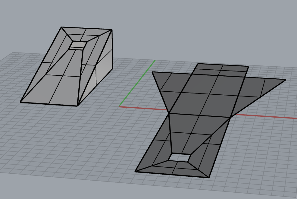
As you can see, each object was assigned its own layer (not just in the layer menu here, but in the object's specific menu as well). Here's the thing though: in order to be coloured differently, each part had to be inserted into its own layer. Only after creating a layer and selecting the layer (a layer is selected if you have double clicked it and the black checkmark has shown up) can you insert an object so as to change its material from other other objects in Rhino.

I'm sure there are some of you who have figured this out (or found a better way), but I figured I might as well share the method I came up with to anyone who might find this information handy.